“As a private person, I have a passion for landscape, and I have never seen one improved by a billboard. Where every prospect pleases, man is at his vilest when he erects a billboard.“, a private person once said.
He continued, “…When I retire from Madison Avenue, I am going to start a secret society of masked vigilantes who will travel around the world on silent motor bicycles, chopping down posters at the dark of the moon. How many juries will convict us when we are caught in these acts of beneficent citizenship?“. That private person was in fact a rather public one, David Ogilvy, founder of the Ogilvy & Mather advertising agency, quoted from his book Confessions of an Advertising Man, 1963. Master–puppet-master turns culture jammer. Right-on.
It is a fascinating trick of the human mind, to crack on in your endeavour, while deep down your conscience is at fundamental odds with it. A debate for another day, I won’t judge, I’m as much a hypocrite as the next man.
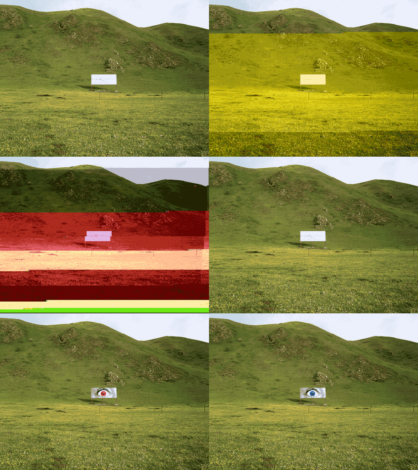
On the matter of this billboard and why I took this photo, it held a strange allure for me. An enormous, blank sheet of aluminium glinting in the sunlight, it was tragic, and majestic. Planted a hundred miles from any kind of civilisation in the middle of the Tibetan plateau, I was really drawn to it. It appeared like Arthur C. Clark’s monolith in 2001, an eerie, out of context, geometric counterpoint to a vast, barren green expanse. Why was it here? What message had it, or was going to convey? To whom, the yaks? I could speculate it would have been a triumphal neo-colonial territory marker from the CCP’s propaganda department, or maybe just something as banal as an ad for the latest instant noodle brand.
The incongruous placement, or juxtaposition of this manmade object and what it signified added to the scene. Controversial I know, and undoubtedly I am of a generation so bombarded with signs and signals that I am slightly immune to it. The world of marketing and commercial transmission reaches so deeply into every corner of the modern world, it is expected. One aspect of its appeal relates to this: there is a narrative conflict between the world of modern commerce, industry and marcom, of metropolitan execs in crisp clobber fretting over the creative, the ROI, the KPI, the segmentation, and here we have a manifestation of that engagement, way out in the wilderness for the nomadic Tibetan yak herders, the monks, the wolves and the eagles, what do they make of it?
The concept, composition and framing shares something with the New Topographics movement – I’m a great admirer of Lewis Baltz in particular, with his sparse renderings of manmade structures and human intervention in the natural environment. Even more so the epic work of Andreas Gursky, and Edward Burtynsky. But more fundamentally the other half is about the subconscious appeal toward the aesthetic of disruption. Where something anomalous, something that breaks the pattern, something unexpected, can be much more stimulating than the safe, warm blanket and mug of cocoa that is expected continuity – the image is interesting because of the object planted in the field, otherwise, it would just be a field.

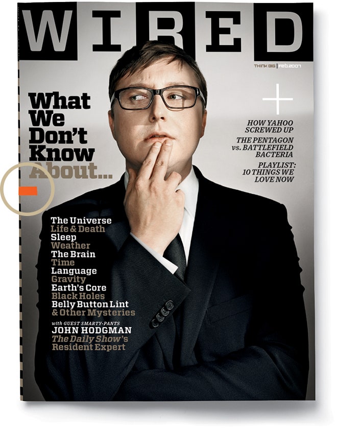
Scott Daddich, former creative director (then editor) of Wired Magazine, wrote a pretty comprehensive editorial piece that relates to this. He described it as Wrong Theory – where he first was prompted to break the foundational rules of design, that every element in a composition should serve a purpose and not be there for its own sake. In the above image you can see the small circled blip of orange poking in from the left edge of the format. His story is refreshingly candid about the motivation and intent here, but the end result was spot on. An otherwise perfectly well-composed and art directed cover needed something else. This level of perfection, when scanning your eye across the magazine rack, is replicated everywhere: high key portrait of ‘significant somebody’, perfectly selected typography, aligned to a tight grid, etc. What is it that differentiates? What is it that commands attention and elevates above the noise? The steady, continuous churn of adhering to what is ‘correct’, the right way to do things, ordered, reasoned, immediately understandable and explainable, we crave more. Sure, in aesthetic appreciation we rightly admire something rendered to absolute heights of ‘perfection’; whether that be orchestral, painterly or architectural excellence, but we also identify with things that are imperfect, because life is imperfect, imperfections are part of our tapestry, and they make things unique.
This same theory explains the power and significance of a broad range of creative expression, covering everything from the graphic design of David Carson, or Emigre magazine, but dating way back to the deconstructivist and Dadaist art movements (we could easily go back further than this even). Publications like Merz magazine, or a great many artists of the time who played with collage and cut’n’paste, partially obscured overlapping compositions, flirting with the boundaries of conventional creative practise. It holds true in other realms, such as the freeform jazz of Miles Davis and the subsequent generations of musicians who would layer and texture their production with distortion and colliding or competing soundscapes. Imperfections jump out, make your ears prick up, bring something to life beyond the traditional anticipated patterns.
This all feeds from Gestalt theory – where we come to make sense of the world by processing stimuli according to acquired familiarity with the patterns we encounter. Rules that include repetition, proximity, continuity, common fate, and so on are all vital to the successful creation of visual communication and continue to be applied across all media. The adherence to these rules is important, but the other side to this is successfully subverting them, whereby the interruptions to a pattern or expectation are in fact more stimulating because they deviate. They offer uniqueness, differentiation, and memorability.
Clearly in the case of my photograph here, the scene would not hold its ominous, conflicted charm if the billboard had an actual ad or political propaganda statement adorning it; it’s emptiness gives it a tragicomic quality, to whom, and about what am I supposed to be broadcasting way out here in the Himalaya? Of course what Mr Ogilvy was criticising more was not the physical object, but rather the corrupting of, or violation of a pastoral innocence with the steady creep of consumerism. Agreed. But in this case, captured and immortalised as a visual motif, that ‘corruption’ is precisely what tickles my cerebral cortices. Human impact on the environment, for better or worse, is our reality. I’m not here to judge, this just formed a great opportunity for me to dribble on about visual impact and what we see in what we see.