The psychology of communication design is about understanding emotional responses to stimuli. I’m reviving this essay – originally penned in 2012 – looking at examples in East Asian culture and the rationale behind aesthetic choices that connect us with our inner child; a phenomenon now firmly prevalent across global communication landscapes.
With the ubiquity of infantilised creative engagement being used to convince people that: obeying the law, shopping for mortgages, making tech purchases, or hiring a business development consultant – service offers distinctly not for kids – can all somehow be sold as ‘child’s play’, I wanted to dig a bit deeper into exactly why and how this approach works and how far this is being leveraged.
Before we tuck in, there’s a bit of housekeeping and some 101’s and twos to go through. First up, a little introduction of how our senses work. It is essential to understand the neurological connections being made and how we take stimuli on an emotional level that in turn triggers response or action. I selected a case study to demonstrate this. Later on will discuss the relevance in: sensitivity to graphic form, cultural factors that affect taste and desirability, the so-called Cult of Cute and how this is manifested in iconography, typography, branding and communication touchpoints in general.
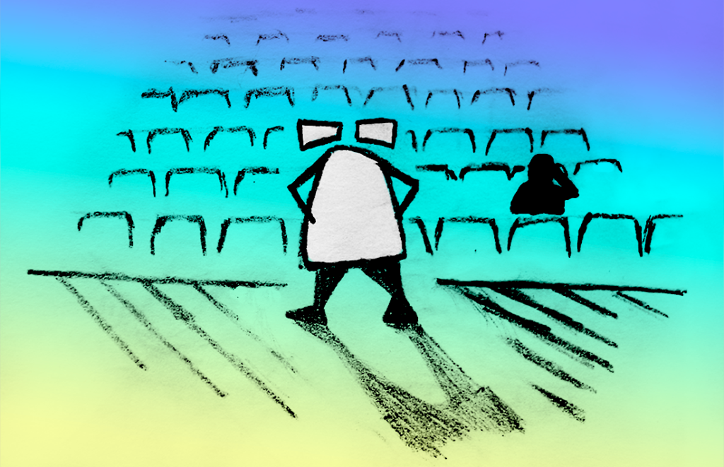
So, we are going to meet our dear professor for some introductory remarks, just to make sure we’re all on the same page. (Get comfy, this is a mid-length read.)
So, wait? What’s this whole Gestalt thing anyway?

First off, the principles of Gestalt refer to a series of sensory perception rules that help us make sense of the world around us. To understand what we encounter, but more than this, be able to read between the lines, draw conclusions and help us avoid being gobbled up by crocodiles*. In the case of design, it is employed to help us engage with an object, media, language or environment put in front of us. It helps to convey meaning, positive/negative association and make inferences on extremely subtle levels. To illustrate these principles in a simple way, I’m analysing visual identity and communications in East Asian culture; with signage as a core exemplar and the circumstances that conspire to create it.
“If we move up the levels of perception, we can move inside to ‘the theater of our mind’ and notice what and how we represent things that we have neurologically picked up via our sense receptors and seemingly present them to ourselves again… This facsimile of the world that we re-present inside our ‘mind’ (our mental processing) provides us the ‘languages of the mind’ by which we can ‘run our own brain’ and … in that way we induce ourselves into mind-body-emotion states.” (Hall, L.M. 2010)
How we see and how we understand what we see is not built on an innate understanding of all images, events, scenes, objects, circumstances. We are not born unto the world with this knowledge. Rather, how we perceive or process information is based on a kind of rapid-fire deductive reasoning. Johan Goethe and Emanuel Kant, among other esteemed thinkers in our recent history, talked of the process by which we come to reading our environments and interpreting information, but it was Christian von Ehrenfels who gave us a clearly defined set of principles, die Gestalt, through which to describe this. How, when we gaze upon, particularly visual form, we have the capacity to gather together composite elements and are able to draw conclusions from them – generate a complete whole. Our sensory understanding is built on these principles.
These principles not only allow us to communicate ideas through literal, representational meaning, but also on a more subtle, elegant and playful level – this works on a visual plane, but relates to how our sensory relationship with the world works in general – and through it we can describe and convey quite complex ideas and emotions as well.
I’m going to introduce how this understanding of the Gestalt principles provide an invaluable tool for designers and communicators to challenge and engage intended audiences by relying on the core perceptive abilities of the human mind.

Reading Between the Lines
Speaking to the purely form-based application, when we are presented with a graphic image, symbol, logo, icon, whether it be a linguistic character, figurative or abstract form, our ability to recognise is based on one or more of the following Gestalt principles:
- Similarity dictates that if an item we are presented with resembles something we already know, we will apply that preinstalled sense of what something ‘looks like’ on top of this new item.
- If we come across a series of separate(d) items, we can draw a conclusion that they are related to one another, this is pattern recognition and draws on senses of unity and proximity. Related to this is spotting anomalies or breaks from a pattern.
- If we come across an incomplete item we can fill in the blanks, this relies on closure and common fate.
- Similarly we are able to follow a suggested visual path across a plane if we have been provided with at least the beginnings of a line, real or implied – this is the principle of continuity.
Based on these visual abilities we can interpret visual input. But how does this work?
How vision works is important to us. Without getting too bogged down in the bio-mechanics of it I will try to summarise the process. Information enters the eye in the form of light as reflected off surfaces. The back of the eye does a little filing of RGB in its rods and photoreceptors, among other things, then the signals are fired off down the optic nerve, on into the visual cortices. This is where it gets really interesting; where depth perception and form are ‘triangulated’ between V1 and V2 (there are 4 visual cortices, V1-4), but most useful for us here is that in fact what we see is not so much continuous motion but an editing together of frames or snapshots of the outside world. What is allowing us to see smoothly as we cast our gaze around relies on a back catalogue of recognition of forms and objects; this goes down in V3/V4.
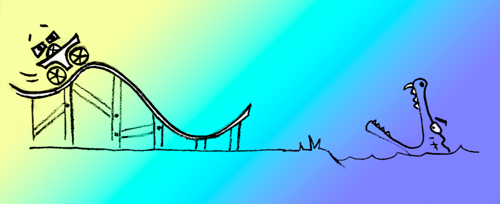
Our visual sense of the world is entirely based on assumptions we can make from images we already possess (a collection we obviously continue to build on throughout our lives). We recognise an edge/line and basically assume or accept its logical continuation and then any changes or anomalies because we’ve seen it all before essentially (not exactly the same scene and arrangement of course, but similarities are there and conclusions can be drawn). This is what allows us to keep from tripping over an uneven paving stone or walking off the edge of a tall building, or similar mishaps …

This process of perception can be explained through Gestalt theory. We all have self-organising tendencies; making sense of the world around us based on a catalogue of visual memories, it is pretty clear how easy we find it to complete partial images (closure), recognise pattern (similarity), follow implied lines (continuity) and so on. A step further, it can also explain how other stimuli is perceived and processed in the mind; taking associative inferences from the written and spoken word, colour, music and all other forms of sensory stimuli as well. In other words, Gestalt refers to intellectual reasoning as much as it does to a visual comprehension of the physical world before our eyes. From a creative point of view, a good grasp of these principles allows us not only to express form in a visual way, but also for very subtle, suggestive communication on many levels. Based on past experience, informed by cultural, social and environmental norms, we can all interpret visual cues and relate to meaning inferred through language, text and subtext by association and recall.
Part Two – Biting the Wax Tadpole
Now taking this (ultra-condensed) understanding of how visual stimuli and cognitive or emotional responses are connected, let’s look a little more at how this happens in a lingual way. The Chinese written language is picto/ideographic. Each character is an abstract graphic representation of an object or concept. It differs from Latin/Arabic/Cyrillic, which have an alphabet made of arbitrary marks and symbols that when arranged in specific ways generate a learned meaning; in and of themselves they provoke no useful insight whatsoever.
Bold Leap. There is some logic to suggest that a culture raised on a pictorially representational language has a higher propensity toward understanding literal visual stimuli; tapping more directly into visual memory triggers than a language that relies on conjuring your own images, drawing your own visual conclusions. This is of course not to say that Latin-rooted or alphabetic languages are more articulate or poetically expressive, or that Chinese is limited in that regard, but I do believe that this difference lends itself in asian cultures raised on ideograms to at least facilitate a high degree of readiness to respond well to graphic stimuli.

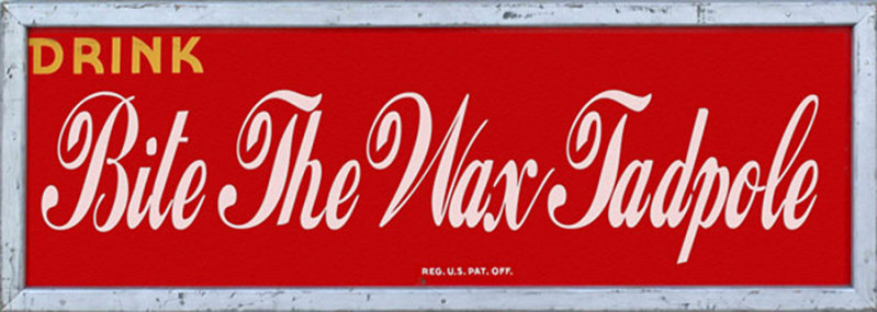
Brand communication in China has some pitfalls, particularly in terms of integrating with international communication and lingua franca. An example of this is in copywriting, brand naming and localisation. Coca-Cola, which has been in the Chinese marketplace for more than half a century, had a great deal of trouble finding a suitable expression for its name in Mandarin Chinese.
Often, foreign brands trying to bed into China opt for homophonic matches in existing Chinese words – Chinese words combined to sound-a-like the foreign language name, with sometimes hilarious consequences. Coke had variously been presented in outlets as “female horse fastened with wax”, “wax flattened mare” or, my personal favorite “bite the wax tadpole” (蝌蚪啃蜡), these being various literal translations of the Chinese characters chosen purely for their approximately similar spoken pronunciation. They did finally arrive at an official trademarked name, translating literally as “to permit mouth to be able to rejoice” ( 可口可乐), in addition to being a close homophonic match (ke-ke-ke-le), a much more flattering – if clunky – literal description for the product.

You can see how relying on our mental processing of associative image memory, undesirable associations might be made with these bizarre descriptions of what, in this case, many regard as a perfectly pleasant and tasty beverage. This is an area of global communication where there is a lot of scope for misunderstanding if not outright ridicule, loss of business or even causing offence. So, what should we hold on to from all this?
- The visual interpretation of stimuli is tied directly to emotional response triggers based on established memories, catalogued understanding and rationality, all of which can be utilised in communicating on conscious and subconscious levels.
- It can also help us identify specific themes in communication design and what exactly they are tapping into.
Part three – Typocutesy

There are peculiarities in the Asian visual landscape. A very specific ocular discourse. Within this there is a particularly strong fondness for a certain kind of expression – the Cult of Cute. This has been widely discussed in recent years, most often focused on Japan, but it is a global phenomenon, just much more keenly observed across East Asia. With a kaleidoscope of manga, cosplay, lolitta, gamer culture, pachinko and porn, Japan is easily identified as the high temple of imaginations running wild; kitsch, bizarre, a little wrong sometimes, but fundamentally very often ‘cute’. In Japan this is known as Kawaii.
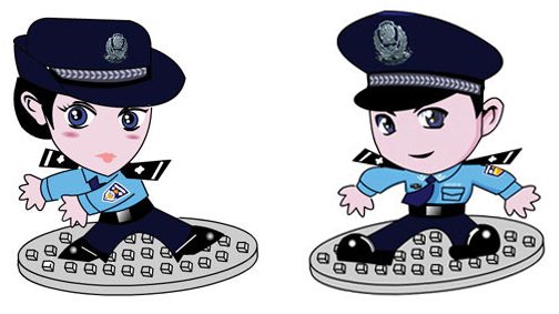
China is equally drawn to this form of expression. From the bubble font used on the ubiquitous video portal Youku.com, to the anime avatars created by the Public Security Bureau, JingJing and ChaCha* – these two represent a rather unsettling image of protectors of the people as bug-eyed, adolescents; an internet-monitoring, crime-busting, avatar duo. Trust, obey.
“Authority figures often put on displays of cuteness to reach out to the masses.” (Garger, I. 2007, Global Psyche: One Nation Under Cute)
What is this fascination with cute? Well there are a couple of signifiers that lead to it. First of all, in societies where there is a certain degree of emotional repression, as is unquestionably the case in East Asian countries like China and Japan; socialisation relies on deference to your seniors and authority figures. Carrying a demeanour of childlike innocence, an emotional dependence on others is often seen to be triggering sympathy as a form of respect. This is particularly true of Japan, but still very present in Chinese society. The social ceremonial traditions are much less rigid in China, but these same hierarchies do exist. Where the adult world presents certain social and emotional restrictions there will be a certain amount of introversion. This circumstance allows for the obsessions with gaming, cosplay and other ‘behind closed doors’ ways of letting your inner being loose.
An aspect of this cutesy state of mind has been termed pedamorphosis – a retention of child-like characteristics. Moving around Asian city streets and riding the subway, you are surrounded by ads that play on a fixation with youth and the inferred sense of fun and abandon this represents. There are obsessions with animated worlds – see the Chinese box office takings for Transformers the movie, or indeed the door panels of middle-aged LGV drivers festooned with Optimus Prime decals; anthropomorphic baubles hanging from cellphones, querky thumb drives, if not in fact whole backpacks in the form of turtle shells or lego blocks, and furry hats with ears, there are many many signs that cuteness is en vogue in East Asia, and not just for the kids.
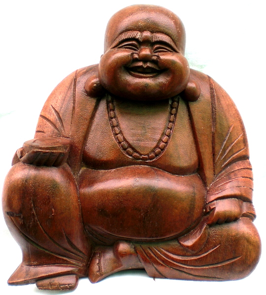
A second factor is the sight of a baby, which causes an involuntary feeling of great joy in most of us (unless you are of the psychopathic persuasion). A chemical reaction takes place and our brains light up when we are confronted with said infant because we are ALL hard-wired to nurture and protect our offspring, therefore it provokes a softening and compliance in us that is actually hard to fight for most, even when the offspring are not of our own bloodline. This translates into the world of visual communication where, if in fact a baby is not literally present, then form, texture and colour palettes that allow us to draw connections with that emotional response toward babies is often employed. Examples of this are over-sized heads and eyes (in figurative human representations) and overall plumpness of form amongst other things, all reminiscent of a baby.
To illustrate this, by far the most ubiquitous ornamental deity you will see around China is that of the ‘laughing Buddha’. Whats not to like? He’s grinning from ear to ear, has comically oversized features, a big round belly, usually rendered reclining and at ease, the classic representation of health, wealth and happiness. This is quite a celebrated and still prized physical form that many parents actually encourage in their kids – one fifth of Chinese kids are clinically obese according to recent reports. Maybe this is some conscious, strange attempt to maintain these cherished baby-like proportions as the child grows, maybe not, but I am confident it is the above stated associations that make him easy on the eyes of those doting, spoon-wielding Asian parents and grandparents.
Let’s get to it then
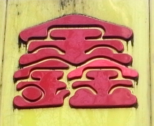
These points basically led me to observe that in typographic and isologotype selections, as with many other arenas in the Chinese visual landscape, there is a real trend toward injecting said cuteness. Precisely because the Gestalt of softer, rounder, chubbier strokes, and in some cases overall proportions of characters, combined with either candy colouring or other vibrant palettes, stimulate associations with childhood. I wanted to test this theory. This phenomenon, as stated, is witnessed throughout the streets of East Asia, but let me share a very simple and controlled research observation: I spent a day combing the length of one of Beijing’s busy kilometre-long city centre shopping streets. The aim was to catalogue how many instances of ‘cute’ were to be found in the shop front signage, logo design and typographic choices in their branding. Results show that in at least sixty percent of the businesses along this stretch, there were definite ‘cuteness markers’ on display.
The Evidence

The demands of Chinese characters to be rendered legibly – both simplified and especially traditional forms, usually dictates a careful stroke and clean, often fine, or in modern simplified renderings, squared-off line. The other typical presentation is that of more cursive esoteric script, especially for businesses seeking to portray a ‘traditional’ or heritage slant, restaurants often run this. Further still there is some play with the various historical incarnations of the written Chinese form, ‘large seal script’, ‘clerical script’ to name just two, but what I was able to confirm is that no matter what the business type; from musical instruments, to pets, to convenience stores, apparel, DIY, the signage presented a friendly, cutesy type selection. By friendly I mean the opposite of commercial or corporate, either presented in an uber-heavy line, bubblegum colour palette, bubble-letter form (bloated, no sharp corners), drop-shadowed comic book header and indeed iso-logotypes with out-and-out cutesy graphic elements such as cartoon mascots or other iconography. I collected photos of over 60 instances in a street comprised of a little over a hundred shop fronts.
Austere and overtly formal type use in brand marks and related graphics present a certain image that will imply class, sophistication, sincerity and so on, but if presented with two equivalent products or services, one branded thus and the other presented in candy-coloured bubble-type, there will be a very different appeal and arguably a more powerful inherent emotional leaning toward the latter.
Upshot
This missive should accomplish two things. First it illustrates that Gestalt on a basic level plays a significant role in how we make sense of the world, beyond joining the dots in the literal visual sense, it is also how we draw emotional responses to, and intellectual conclusions from stimuli based on social and culturally learned norms. By looking at this case study of cuteness in Chinese brand communication, we can recognise the Gestalt principles at work; whereby the pedamorphic socialisation many Asian citizens grow up with prepares a well defined visual hook for brand developers – and propaganda departments – to hang identities and broad visual comms on, tying together the cognitive processes of visual and lingual form recognition and intellectual inference. Knowing what we know about how our perception of things works, and how we apply these principles in our reading of form and aesthetics, it is easy to acknowledge how this can be leveraged.
While the observations cited in this – let’s be honest, rather whimsical and rigorless case study – are referencing mainly small-scale independent enterprises in a distant corner of the world, it very much exists in international scale marcom and everyday visual engagement as well. The desired response from the businesses presenting their brand in this manner is simply to catch the eye and draw in custom and this is happening regardless of whether their product has any relation to youth culture, let alone actual infant or children’s merchandise. Despite the obvious appeal to a certain generational demographic, a weakness for cuteness is universal. While this is a widely documented Asian phenomenon, it is not exclusively so. Western audiences are equally pleased by imagery and iconography that is playful, youthful and pedamorphic. All humans are prone to getting wobbly-kneed and goo-goo-ga-ga over imagery that stimulates the nurture instinct.
Just how far can this basic pedamorphic instinct be put to work? What manner of distinctly adult-oriented message might we apply it to? To update this essay – now some years on from its 2012 origins – with the development of channels and technology, the wide-scale adoption of human-centred design, cultural insight and inclusivity-driven tactics, and in no small part prompted by growing competition between organisations for ever-increasing global audiences in every marketplace and sector, the efforts to cut through the noise and generate deep engagement has only intensified. It is notable how widely this angle is being applied.
You can look at examples across the board from mobile phone brands to corporate annual reports, the homogenising aesthetics of product design in UI experiences to automobiles, the form, colour palettes, typographic selection and so on, are all presenting characteristics that match what has been discussed above. The ubiquitous practise of SAAS branding using an illustrated character-driven visual language for example are doing what I have done myself here in this post; punctuating the content with ‘cute’ graphic ornaments to make the content lighter, fluffier, more approachable, more human, more inner-child-like. Our digital interactions have seen language evolve to a hybrid of text and visual, saturated with emoji and graphic shorthand to replace the written word.
As a parting thought, this is not necessarily finding its appeal on a global stage for all of the same reasons it does in East Asian societies. The universal instinct and appeal is there, tapping into the nurture instinct, but not necessarily the same degree of cultural practise in terms of submission to social hierarchies – though this could be looked at on another day. It might be more to do with being supported by growing pressures and a global sense of gravity and anxiety over economic, political, and social concerns, there is perhaps very obvious reasons for us all to be retreating to a happier more childlike sense of comfort and delight. We are now several generations into the normalisation of gaming culture that draws in and targets adult audiences as much as ‘the kids’. Beyond that there is a huge cultural drive dedicated to encouraging a return to satisfying your ‘inner child’; from adult colouring books to the softening up and gamifying service experiences, content and interactions. A further exploration would be interesting to tag just how many contemporary products, brands and messages are being carried on the back of cartoon avatars, rounded corners, pudgy letterforms or saturated candy colour palettes. Something for the near future, when I have a slow minute.
Hopefully I’ve reasoned out how it works, the power it carries and the extent to which it is used. You’ll be noticing it everywhere!