
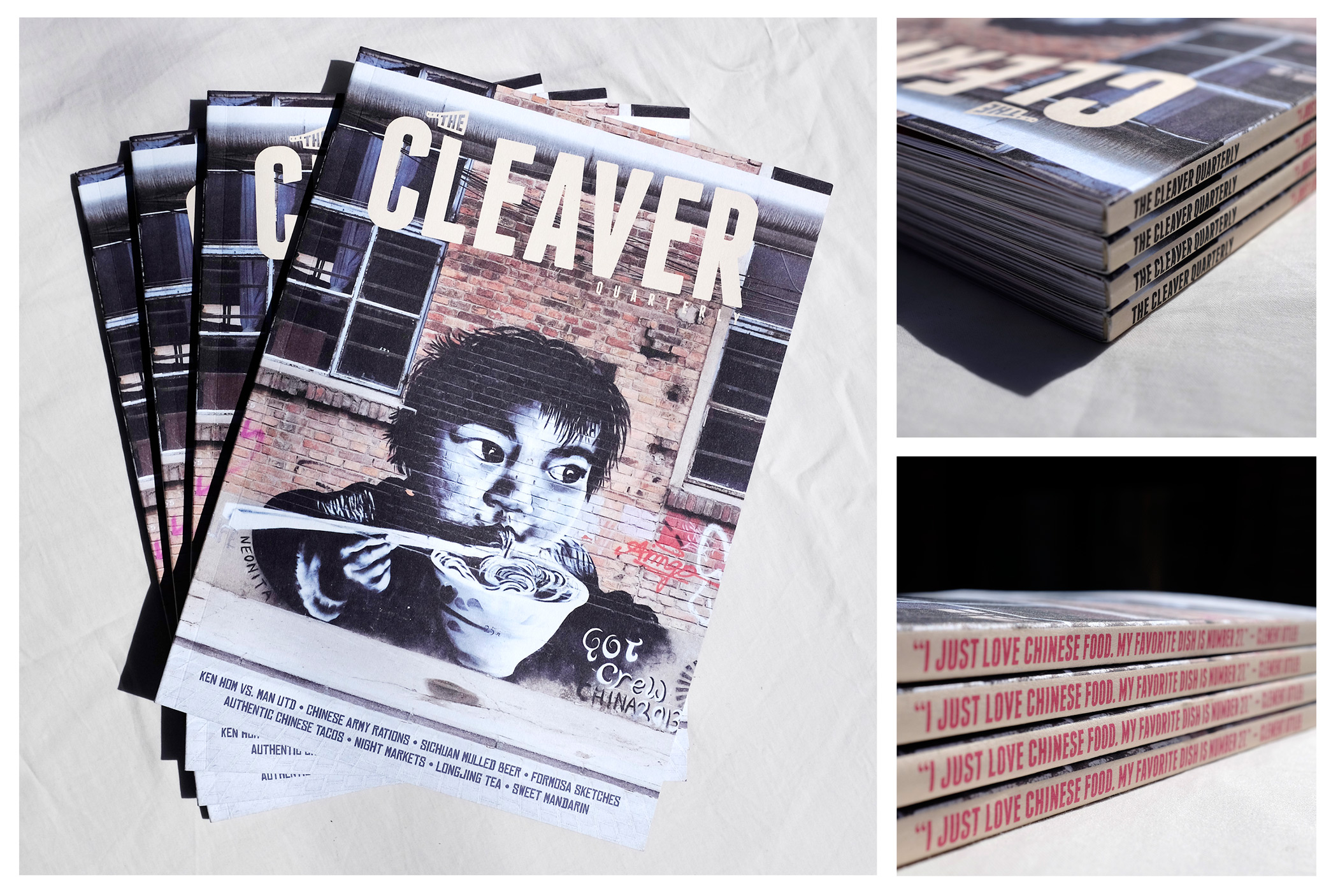


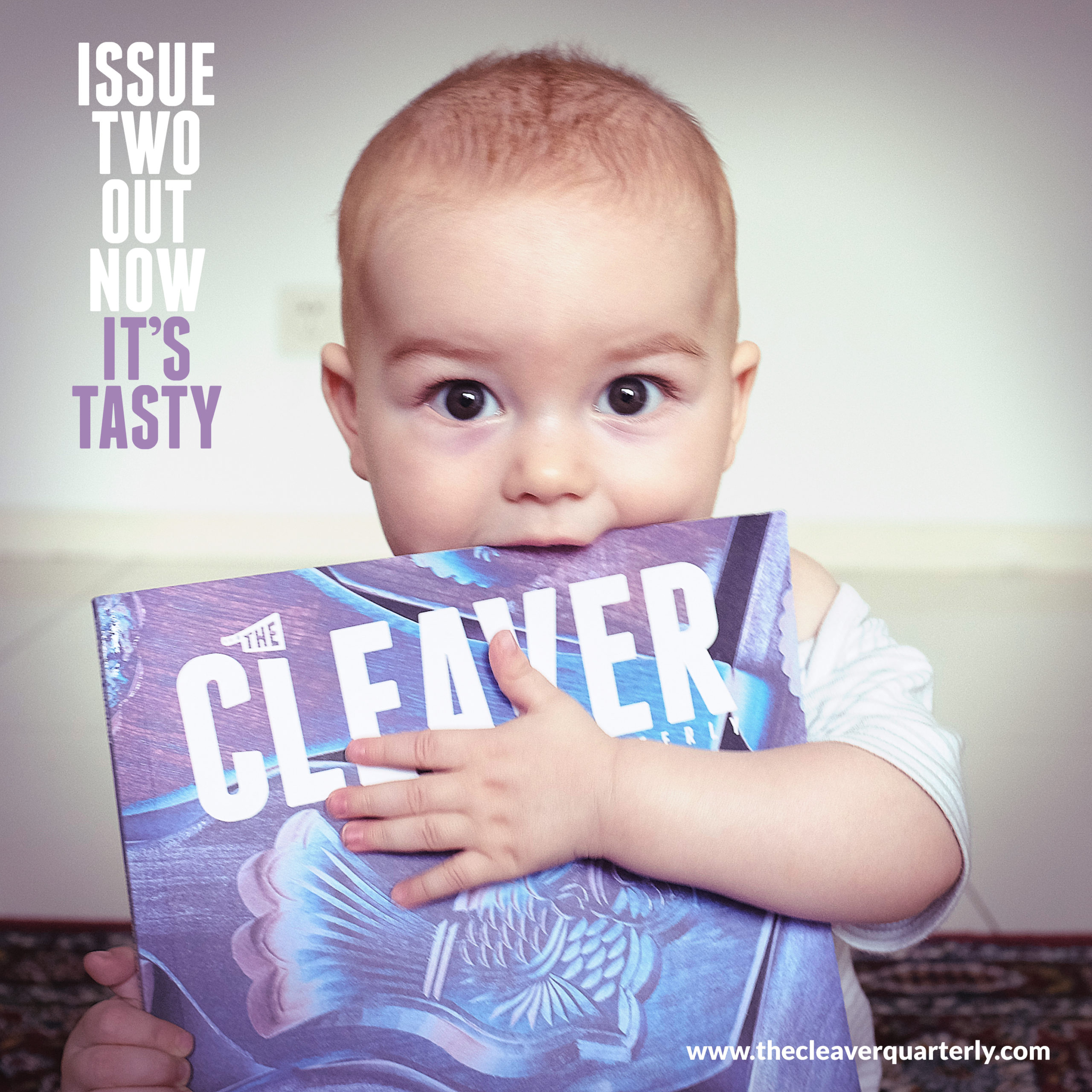
Long form journalism, creative writing and graphic content delving in beyond ‘how-to’ recipes and ‘the top 5 restaurants’; things that more commercial food rags tend to offer. I was brought on to develop the physical and visual presentation of the punky Cleaver Quarterly magazine; covering production, VI, style guide, and to art direct content. Every feature was incredibly diverse and received unique treatment, but had to carry publication-wide DNA – in the vein of Lucky Peach or Hot Rum Cow.
Happily, there is a persisting market for niche-interest publications*, especially if they eschew the conventions of the homogenised Goodhousekeeping or GQ-esque doctors waiting room aesthetic.
Perfect bound, offset, cotton fibre stock; when we set out it was with great affection for the aesthetics and tactile sensory pleasure so integral to the experience of reading a document or taking in graphic material. Building a magazine from scratch was quite an undertaking, and seeing it through to physical print and global distribution was very rewarding.
*They have since gone mainly digital, but continue to produce unique print projects. Being ad-free unfortunately meant for a tough ride.