


TFN is produced by SCVO, shares the same values and ethos, and a major aspect of my role was to foster greater cross-service engagement, while raising awareness of SCVO’s significant contributions across their numerous services and areas of work in the voluntary sector. This would in-turn garner the accompanying trust in, and acknowledgement of their efforts.
So, this was effectively redesign of the publication, refreshing the TFN identity and marcom output, improving site content, architecture and UX — one stream of work among the much larger internal restructuring and organisational repositioning.
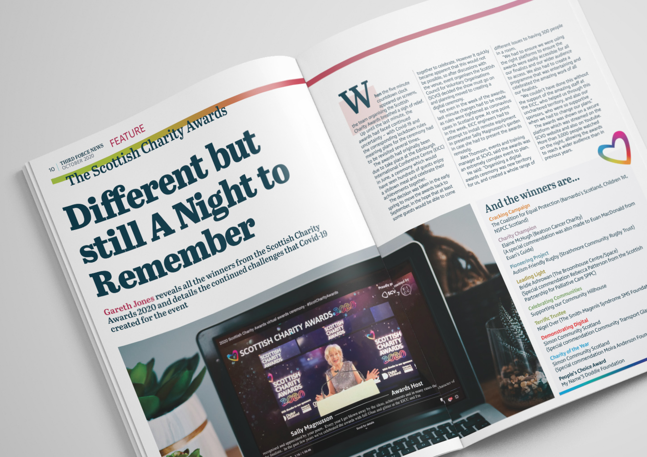
An example of how we met the above requirements – in showing a sisterly bond, while expressing independence, was with a subtle pull-through of core SCVO brand DNA. We applied the same principles of a cleaner, open and inclusive digital UX, and treatments of all marcom collateral. We brought across the highly accessible custom typography for body copy, while selecting a more sophisticated display typeface that would compliment that, giving TFN a more contemporary, distinct, and newsy flavour. This was further enforced with revised guidelines on photography and graphic style, as well as introduction of a more streamlined, but vibrant and confident colour palette.
We developed, and worked to the following strategic brand characteristics.
“The voice of the Scotland’s vibrant voluntary sector.”
“Scotland’s only dedicated daily news outlet for charities and voluntary organisations.”
Not a fanboy(/girl), but certainly a herald. Focused equally on framing the trials and tribulations, while spotlighting the inspirational efforts and successes. Not florid, no bombast, nor muck-raking. An open, measured, and critical eye on the sector.
This is not a crass, stodgy redtop, nor a bloated, opinionated broadsheet. Nor is it quite the elegant, reflective editorial of a NewYorker or Prospect. Unfussy, considered and probing. There is need to carry the momentum and drive of the ’24hr news’ cycle; up-to-the-minute, matter-of-fact, but balanced with some reflective editorial style. It also should bring an air of professional and commercial savvy, for credibility and engagement.
This was taking place during lockdown in 2020, and while also a print publication, it moved to digital e-mag format until such time as feels appropriate to resume physical distribution. I will be looking forward to the implementation of our design development when that day comes.