
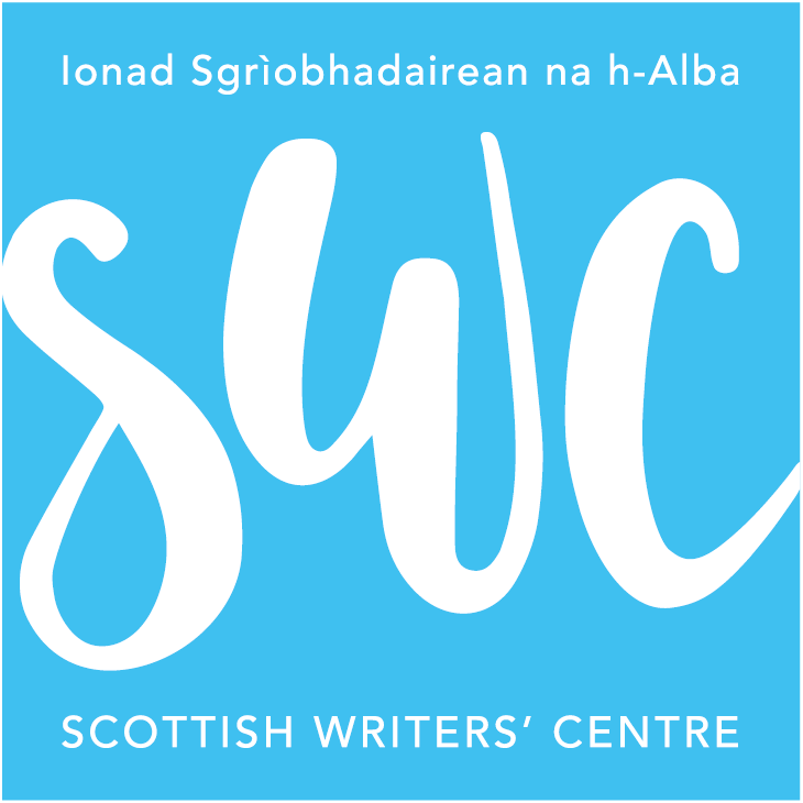


Requirements were to present an eye-catching and simple identity that helps them look more professional, expressive, be ‘younger’ but that won’t date; “…and absolutely no quills or parchment”, firmly stated in the brief by their director (they don’t want to be about twee, historical sentimentality, or stuffy literati). I opted for a cursive, page/screen boundary-breaking ‘type-in-motion’ logotype, with their acronym at the heart of it. ‘Scottishness’ is carried very loosely (or obliquely?!) in the white figure on blue ground – that, and the copy being half in Scots gaelic of course.
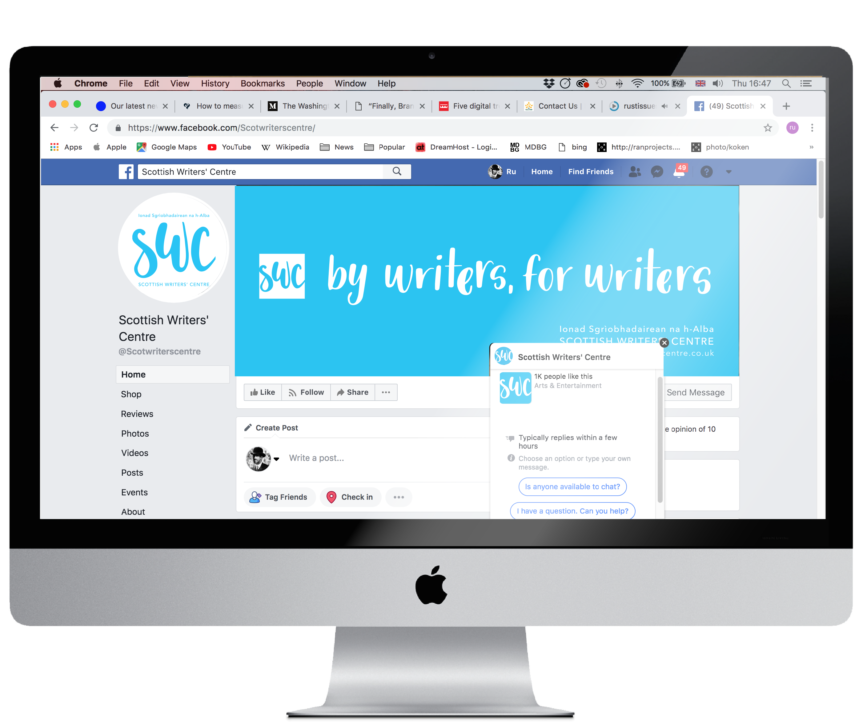
So here is a fresh logotype and a variety of key message typographic items for merchandise and social. I really enjoyed doing this, they are a great bunch, with limited resources. It’s sometimes hard not being engaged in a whole process, to see the vision through; I’m not involved in their comms strategy, web design, or collateral production from this point, but I think they are set up pretty well to be getting on with their mission.