

I worked for a time in the very niche world of marketing for the built environment, across Wordsearch’s Beijing creative studio. Personal values aside, this was professionally invaluable to me because we worked to exacting standards, for extremely demanding clients. Across branding, copywriting, hi-spec print, digital and video/motion collateral; this isn’t public or mass market communication, it has a specific audience segment and particular demands. These are the most expensive products, being sold to the wealthiest UHNW one-percent of the one percent. I learned a great deal, and it was rewarding.
The technical requirements in this kind of project were significant – the key to reinterpreting architects’ plans is offering simplicity and clarity to would-be investors and tenants who wouldn’t make sense of the original, and this had to be integrated with the placemaking, and persuasive storytelling. The brand values and essence carried for major real estate and architectural project marketing is obviously a different world to commercial public marcom in other sectors. Like it or not, if Sir Cashalot is to be spending big on a monument to their success (ego), then the packaging obviously needs to reflect the outlay. So we are in the realm of luxury branding, with huge budgets for the best materials, visual touchpoints, physical spaces and events.
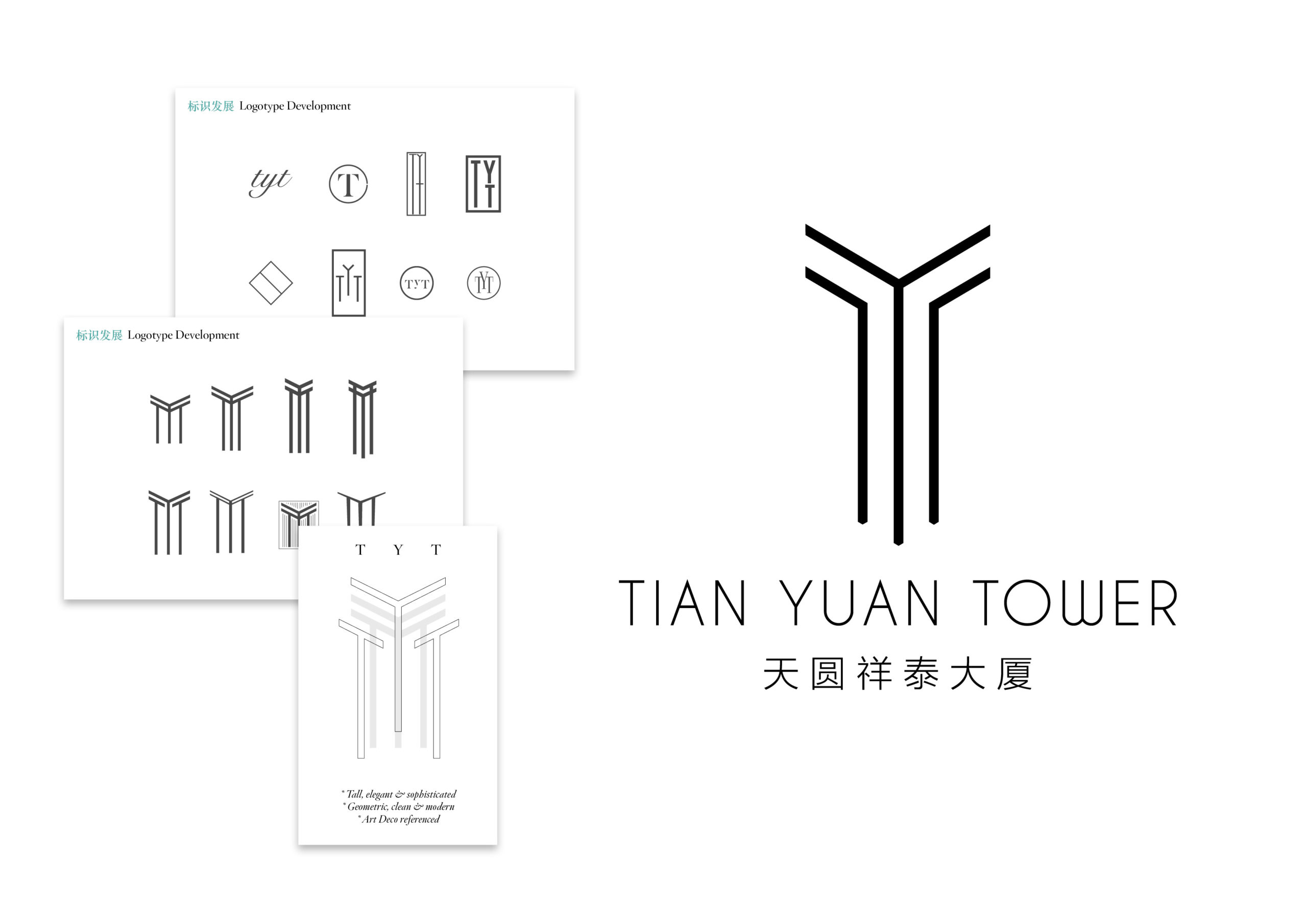
Tian Yuan Xiang Tai Da Xia (Tian Yuan Tower), in Beijing is a ‘smart building’, the positioning and collateral was to carry an air of executive luxury but also to channel technical excellence and performance, since the building is part of a newly emerging business district in the Olympic village area of the city. This is by far not the most exciting piece of work I ever had a hand in, and certainly not the most exciting piece of architecture on the planet. Neither is it among the highest profile projects Wordsearch have worked on, but nonetheless it was something we pitched, won and were commissioned for, and we gave the same level of craft and attention as any other piece of work we would do.
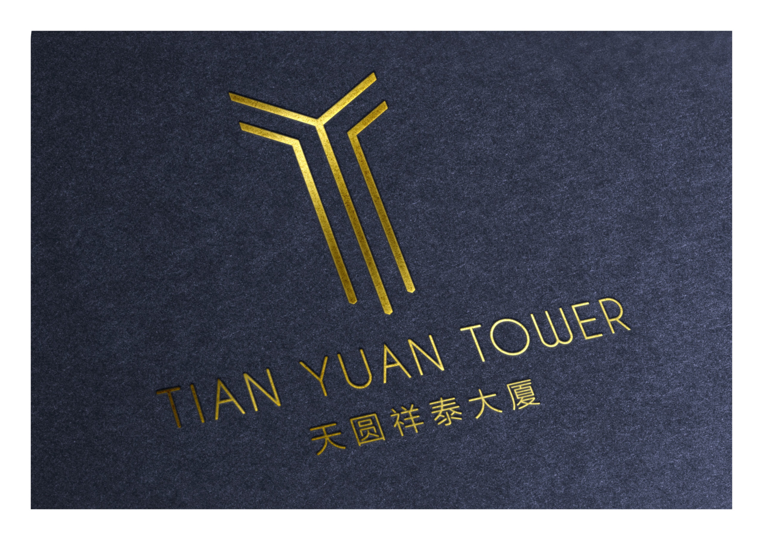
The project involved brand building, VI, hi-spec rendering visualisation, well-packaged marketing collateral, and environmental artefacts for the sales suite and launch events. There was no small amount of gold foiling used in these materials – bling still a thing with many in these realms, but also the brand VI needs to share the DNA of the building, its purpose and ambition, and to echo wider aspects of the project design. A degree of opulence, and modernist/deco interior fit-out is a theme expressed throughout the building. We found ourselves looking at the art and design of that period, where Futurism and aeropittura amongst other related styles of the early 20th century, with its idolatry of speed, power and technological advancement, became an increasingly obvious fit.
From the selected mood boards here, you can see the route we went down in terms of brand essence and iconography. It took a little while to select appropriate lettering for the word mark, settling on colour palette, image content and rendering styles. Included here are a small sample of the monographic logotype’s the team were testing, but I actually got to the final solution pretty quickly – sometimes things just align so beautifully. It had it all: the elegant weight and height of the lines, the structural interconnection, and directional momentum, and in Gestalt terms, it simultaneously presented an abstract view of the building, the corner portion of a volume, while also serving as a monogram for the building name (TYT). It is reminiscent of the geometric rhythm and precision that was so central to the design of the era we were referencing, but also carrying a dynamic and timeless structure.
… Just a shame, in the end the client did not make full use of it, preferring to apply the isolated wordmark more frequently instead. Why? Well, sometimes a lot of effort, and a lot of money gets thrown at a project, and portions of a larger piece of work simply aren’t valued on a normal human level anymore. Sometimes you don’t generate the trust, or diplomacy in client management fails (as happened here for sure). Or it might sometimes be down to no longer having skin in the game, or a voice to keep championing the importance of maintaining consistent application of brand guidelines after the project is over (as also happened here).
Regardless of what happened on this project, this is but one example of how a seemingly perfect solution goes unloved. There are a million and one outstanding brand strategies, identity routes, logomarks and creative solutions lying disgarded on studio floors around the world. I know that feeling well, of effort and enthusiasm poured into work that makes the grade, but today I’m raising a glass to the brothers and sisters who have fallen along the way. Here’s to you <clink>.