


I was dragged out of retirement to help with consultation on setting up a new bar in our Beijing neighbourhood, Fang. I say that like it took much persuading! In a former life I was a ‘drinksmith’ of some renown and have moonlit more than a few times over the years, so I jumped at the chance to get my hands wet again. I will give another post on the drinks themselves – which are pretty special if I do say so myself, and make great use of local produce and personality – a good drink always requires a good story behind it too. But, in addition to this I was asked to help with VI, menu design and copywriting. I think the results are decent for the relatively shallow budget.
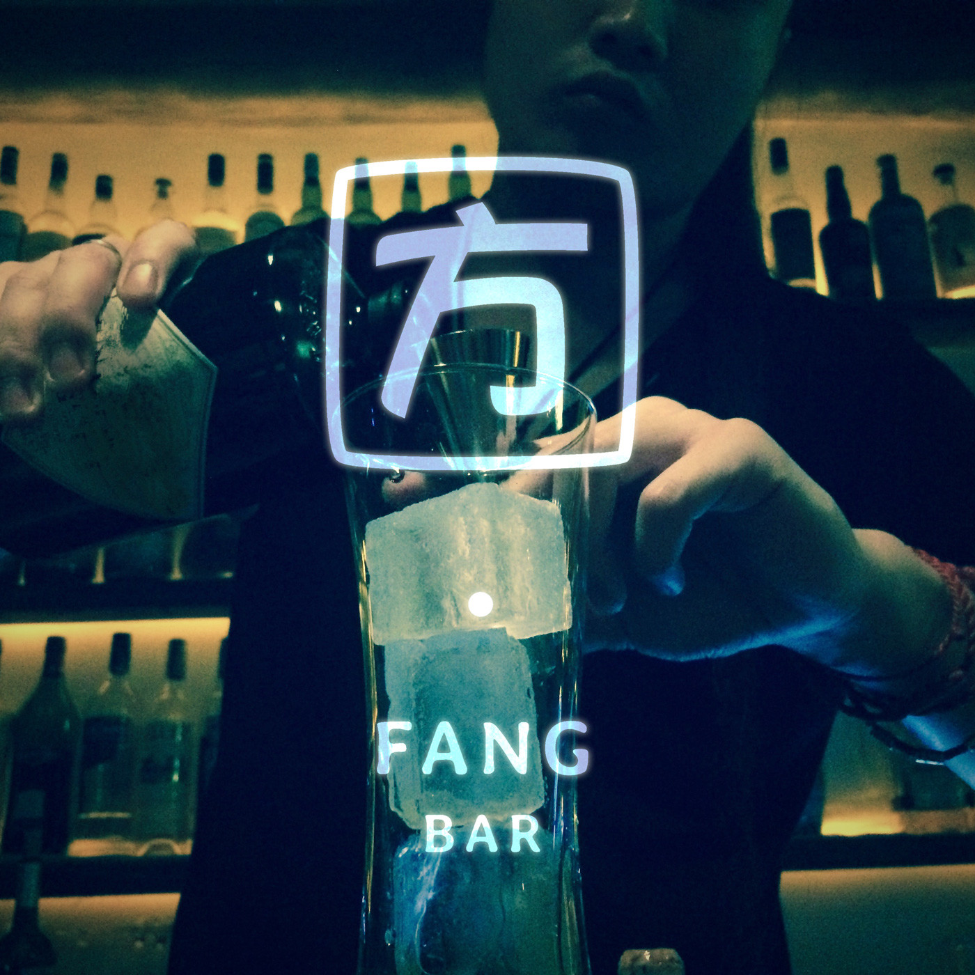
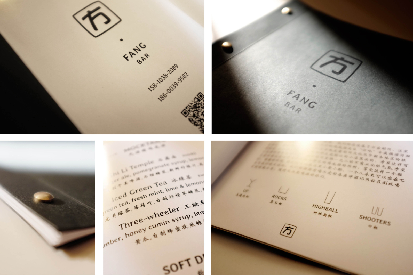
The bar is an intimate and informal joint. Great product and fairly polished service, without the pretence of an ‘uptown’ bar. The bar is also trying to integrate with a neighbourhood in ‘old-Beijing’, which means of course it is part of a wave of hip pseudo-bohemian gentrification, but in decor and attitude the guys are treading lightly. The name itself, Fang, has nothing to do with vampires. This is a Mandarin Chinese word that translates simultaneously as square and home, expressing the concept of a small, homely space contained by walls. The identity and collateral therefore wanted to be, understated, not flashy, but certainly not too consciously antiquated as so many jazz-age, speakeasy, ‘discerning dispensers of authentic libation’ establishments will want to do these days. Yes, I put brass rivets in there, but that’s the only nod to a ‘vintage purveyors’ provenance, I swear. Essentially, it was drawing on traditional asian publishing vibes.
The remit for the primary print collateral; the menu, was to be compact in format, with clean and legible bilingual copy presentation. This was a really nice and technical design exercise requiring a light touch, minimal graphic design, and perfectly matched bi-lingual typography was the order of the day – this is so often so lazily done and really needs a good understanding of both latin and Chinese typographic styles. I think it ticks those boxes.
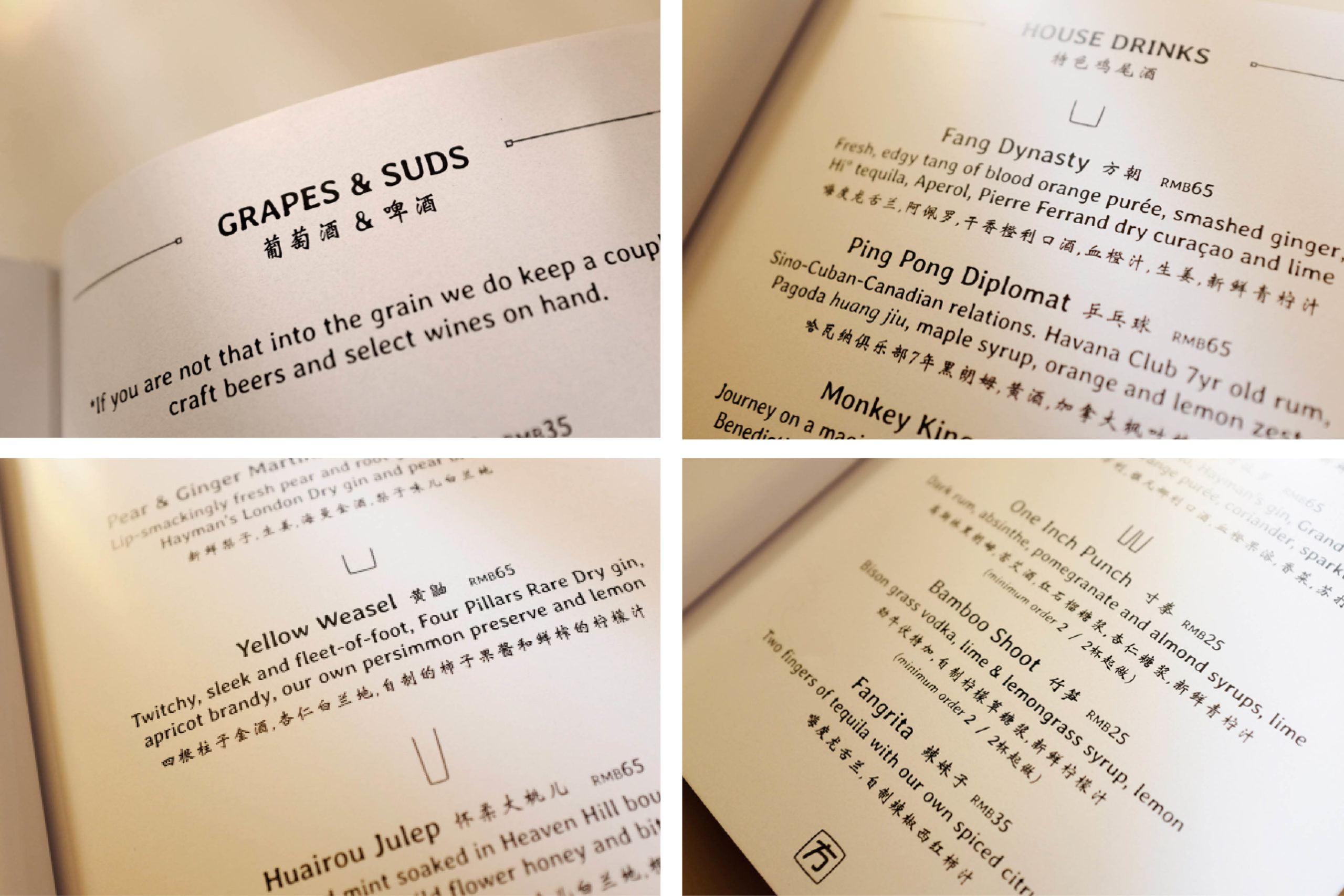
The drink pictured here, the Yellow Weasel, is one of the more simple drinks I created, but with one of the best stories: ”
Mustela Sibirica (Siberian ‘yellow’ weasel) is one of Beijing’s longest-term expats. You may catch fleeting glimpses of this illusive character picking his way through the old city neighborhoods if you’re lucky, and that’s just what he brings if one happens to cross your path. With a steady diet of plundered drying persimmon, left out on windowsills and disgarded sunflower shells that litter the hutong doorsteps, he keeps his eyes keen and a spring in his step.” A sleek and twitchy uptown libation in honour of this cherished Beijing citizen. Staged around the rich persimmon flavour, Four Pillars gin with its complex dry spice and citrus notes was the logical base, paired with a little apricot brandy and fresh citrus for added warmth and to balance tartness in the preserve.